loading...
11-05-2011 15:05
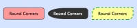
Cách tạo thông báo ấn tượng cho website bằng CSS
Không cần phải dùng đến hình ảnh, bạn vẫn có thể tạo được những thông báo đẹp mắt cho website với những tính năng của CSS.
Chia sẻ:
Bài cùng chủ đề


loading...
Bình luận
Danh mục
Xem nhiều
-
 1
1
-
 2
2
-
 3
3
-
 4
4
-
 5
5

